 adib
adib 
Writer should write a story by think in terms of issues or themes and need to find meaning in the statistics. Writer must be aware that technical report is not a story, nor is there a story in conducting survey. A story tells the reader briefly what you found and why your findings are important to the reader. The article becomes more interesting if the readers feel that the information they received may affect their life.
Here the possible themes or topics:
- Current interest (policy agenda, media coverage)
- Reference to everyday life (food prices, health)
- Reference to a particular group (teens, women, the elderly)
- Personal experience (transportation, education)
- Holiday (Hari Raya, Chinese New Year, Independence Day)
- Current events (statistics on a topic frequently in the news)
- Calendar themes
- New findings
- A regular series
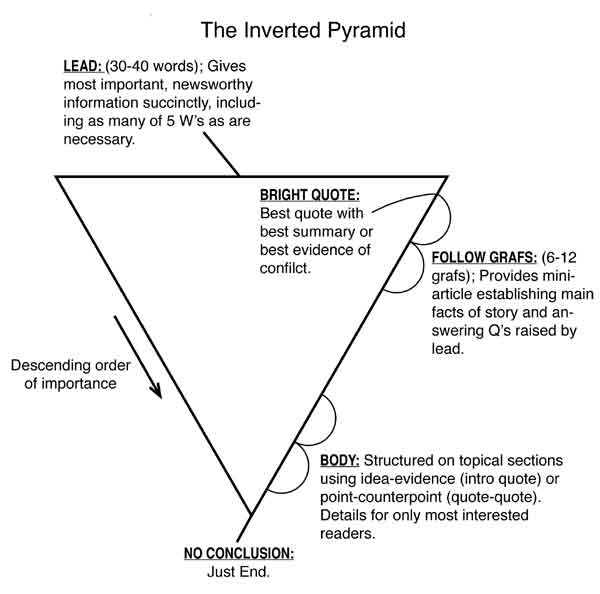
The “inverted pyramid”
Journalists use the “inverted pyramid” techniques in their writing. The “inverted pyramid” technique is writing a conclusion at the beginning of the story followed by secondary points in order of decreasing importance throughout the text. Contrary to analytical writing, the writers start with the thesis that they want to prove followed by the methodology and data, the analysis and the conclusion at the end.
The lead: The first paragraph
The first paragraph or the lead is the most important element of the story. The writer should not introduce the story in the first paragraph, but to tell a story about the data concisely, clearly and simply. The lead must grab the reader’s attention and help the reader to capture the general message of the data.
The lead should contain a few numbers and the writing of the first sentence is better without using any figures. Do not try to summarise the whole report. Rather, provide the most important and interesting facts. Avoid writing the assumptions, explanations of methodology or information on how you collected the data in the first paragraph.
Here the example to write a lead:

Tips:
- Focus on one or two findings
- Write in everyday language
- Create images for your readers
- Focus on the things you want readers to remember
- Choose the points you think are newsworthy and timely
Good Writing Techniques
It will be helpful to the readers if the article is written clearly and simply, using language and a style that a layperson can understand. Terms meaningful to an economist may be foreign to a layperson. Avoid using jargon terms. If you have to use difficult terms, you should explain them the first time they are used.
Paragraph should start with a theme sentence that contains no numbers.
Example:
Norway’s population had a higher growth last year than the year before. The increase amounted to 33,000 people or a growth rate of 0.7%
Tips:

Poor: From January to August, the total square metres of utility floor space building starts rose by 20.5% from January to August period last year
Better: In the first eight months of 2004, the amount of utility floor space started was about 20% higher than in the same period of 2003
Headlines: Make them compelling
Headlines should capture the attention because readers most likely to read the headline before they read the full story. The headline should be short and say something about the findings presented in the article.
Headlines should:
-
Be informative, appealing, magnetic, interesting and newsy and incorporate:
[x]the highest since, the lowest since...
[x]something new
[x]the first time, a record, a continuing trend - Make you want to read the story, not scare you off
- Summarize the most important finding
- Be no longer than one line of type
- Not try to tell everything
- Contain few numbers, if any at all
- Have a verb or implied verb

Graphs
Good statistical graphic:
- Show the big picture by presenting many data points
- Highlight the data by avoiding extra information and distractions, sometimes called “non-data ink” and “chart junk”
- Present logical visual pattern
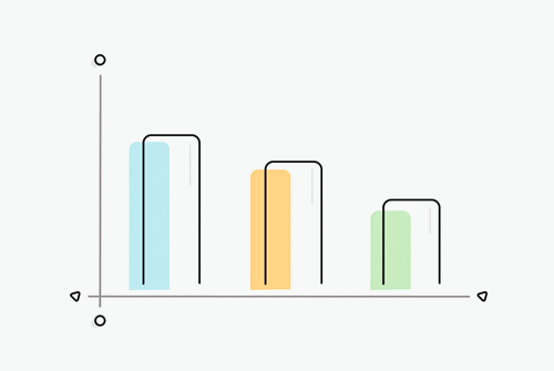 Let the data determine the type of graph. For example, use a line graph for data over time or a bar graph for categorical data.
Achieve clarity in your graphics by:
Let the data determine the type of graph. For example, use a line graph for data over time or a bar graph for categorical data.
Achieve clarity in your graphics by:
- Using solids rather than patterns for line styles and fills
- Avoiding data point markers on line graphs
- Using data values on a graph if they do not interfere with the reader’s ability to see the big picture
- Starting the Y-axis scale at zero
- Using only one unit of measurement per graphic
- Using two-dimensional designs for two-dimensional data
Tables
Numbers easily digestible if presentation table rank data by order or other hierarchies. They show the figures that are the highest and the lowest, as well as other outliers. Large complex tables are appropriate to place in supporting material. While graphics should be accompanied by an analytical heading, titles are preferred for table. They should be short and describe the table’s precise topic or message.
Source: * A guide writing stories about numbers, United Nation Economic Comission for Europe (UNECE)
 OPR-cut 2020 in Economic Recovery